How to Make Your Webinars Accessible to Everyone
November 15, 2022
Topic tags
Promoting a webinar as an exclusive event (behind a registration form, for example) is a clever way to drum up some interest. But do you know what will really win folks over? Providing an inclusive experience. That means making sure your webinar is accessible to everyone — and it’s easier than it sounds. All you need to do is incorporate a few accessibility tools and practices into your webinar strategy.
We’ve got you covered with this guide. Here, you’ll gain some insight into why every webinar should be an inclusive experience for your live and on-demand audiences. And you’ll get a checklist of everything you need to do to make your webinars fully accessible. Let’s dive right in!
Why it’s important to host accessible webinars
Did you know that just over one billion people — or 15% of the world’s population — live with some form of disability?
So statistically speaking, offering accessible webinars will make life easier for about 15% of your audience. We’re talking about folks who are deaf or hard of hearing (DHOH), people who are blind or low vision (BLV), and pretty much anyone else who relies on assistive technology. But that’s not all.
While digital accessibility is especially useful for people with disabilities, many others benefit from it, too. For example, those who face language barriers, have unique learning styles, deal with device restrictions such as broken speakers, or are situated in an area that prevents them from speaking, seeing the screen clearly, or hearing your presentation.
What makes a webinar accessible?
Simply put, an accessible webinar is easy to follow for anyone who has difficulty seeing, hearing, moving, speaking, or understanding information presented in certain ways.
In an accessible webinar, you’d find:
- Built-in assistive tools (like live captions)
- A webinar interface and presentation materials that are compatible with third-party assistive technology
- Distinguishable design elements (like high-contrast colors and easy-to-read font faces)
- Clear audio and good video quality
- Inclusive actions by the host and panelist(s) (like verbally describing key content)
The benefits of hosting accessible webinars
By making your webinars inclusive to everyone, you’re removing barriers and giving your audience full access to your content.
“By making your webinars inclusive to everyone, you’re removing barriers and giving your audience full access to your content.”
This means every attendee gets an opportunity to understand everything and participate in all discussions. This empowers them to gain invaluable insights from your presentation and build deeper connections with everyone else at the event.
Even folks who don’t need digital accessibility would still benefit from attending inclusive webinars. Bigger and more diverse audiences bring more unique perspectives to the table, and this may lead to more productive discussions — and perhaps great ideas!
Hosting accessible webinars also benefits your brand. It helps you reach a wider audience with your content, increase engagement, positively impact your brand image, and avoid discrimination complaints.
We always, always recommend hosting inclusive webinars. It benefits everyone, and you don’t need to put forth much effort to add accessibility tools and practices to your webinar strategy.
All-in-one Video Platform
Streamline Your Webinar Process
How to prepare your webinar to be accessible
First off, it’s super important to be proactive when providing full access to your webinars. That means taking all restrictions into consideration when planning your presentation instead of only catering to the restrictions your audience members have. If you want your event to be truly inclusive, this is the way to do it.
Let’s talk about what you need to do during the planning stage:
Choose the best webinar platform
You can go a long way with the right webinar platform. You want one that offers and supports these accessibility tools:
- Live closed captioning: A feature that automatically displays spoken words as text on the screen in real time
- Keyboard accessibility: Functions (links, buttons, forms, and other controls) that can be operable with only a keyboard
- Screen reader support: Compatibility with software applications that convert digital text into synthesized speech
- Chat functionality: A feature that allows hosts, panelists, and attendees to have text-based conversations with each other during the event
Some accessible webinar platforms even come with a user interface that’s compliant with level AA of the latest version of the Web Content Accessibility Guidelines (WCAG). Those user interfaces may have high-contrast colors and offer the ability to resize text, for example.
Use high-contrast colors in your slides
When you’re designing your presentation slides, be sure to provide enough contrast between the text and background colors, as well as the colors in your graphs. This helps make your slides legible to everyone.
To find a pair of high-contrast colors, look at the color wheel. The farther away the two colors are from each other on the wheel, the higher the contrast. You can’t go wrong with white text on a black background, for example.
You can also use this color contrast checker — it does most of the work for you!
Take the slide design and layout into consideration
You’d be making a world of difference with high-contrast colors in your slides, but that’s not the only thing you can do. There are many more elements to consider when designing your slideshow presentation. If you want to make your slides easy to read and understand, follow these tips:
Minimize the amount of text
Some folks may find it difficult to read paragraphs of text while another person is speaking. It’s a good idea to only include short bullet points and key takeaways in your slides.
Incorporate unique patterns or textures into your graphs
If you rely on color alone to distinguish data, some of your attendees may have a hard time differentiating the segments. That’s why we suggest adding patterns or textures to your graphs. It can’t hurt to directly label each segment, as well.
Use the same template in all of your slides — or whenever possible
This will help limit cognitive load.
Avoid motions and animations except to make information easier to understand
Some people find movements pretty distracting or even nausea-inducing. So use motions and animations only when you need them to get your point across.
Avoid blinking or flashing effects
In the WCAG guidelines, you’d find a threshold of three flashes or below within a one-second period. It’s because flashing effects can cause seizures or other physical reactions. To stay on the safe side, avoid blinking or flashing effects altogether.
Choose a font face that’s easy to read
Stick to simple fonts with consistent thickness.
Send your slideshow presentation to your registrants ahead of time
By doing this, you’re giving your registrants time to familiarize themselves with your content at their own leisure.
Some folks may need to translate key terms into their own language or adapt the slides (like changing the font size) to meet their needs. And those who rely on screen readers will need to be able to access the content because screen readers can’t pick up any text that’s presented via screen sharing.
When sending out your presentation slides, make sure they’re in an editable format. You can find more information about this over at Web Accessibility Initiative’s website.
Do a test run before the event
Want to make sure your live event goes smoothly — and is fully accessible? Grab your panelists (if you have any) and do a test run!
Doing this will give you time to work out any technological kinks before the event. Here are some things you particularly want to pay attention to during the test run:
- Video quality
- Audio quality
- Background noises
- How visible and well-lit everyone’s face is
- The quality of any virtual backgrounds (i.e. make sure they’re not flickering)
Invite your audience to contact you after the webinar
Some of your attendees might have a hard time keeping up with the presentation and/or the chat threads, and some may not be able to type out their questions fast enough. Others may need more time to process the information provided during the webinar. These difficulties could hinder people from asking questions in real time.
By inviting your audience to contact you after the event, you’re giving them a chance to ask questions at their own pace and request clarification for anything they missed.
How to make your on-demand webinars accessible
When you’ve got your on-demand recording, you can do a couple of things to make it more accessible before releasing it into the world:
Find a captioning and transcription service
As we mentioned before, you can use this opportunity to provide more accurate captions, transcripts with visual descriptions, and subtitles in other languages. We use a complete captioning solution called 3Play Media for all of our videos, including our on-demand webinars.
Even though we make sure that all of our live events are captioned, the captions aren’t always accurate and they don’t show up on the on-demand recordings. That’s why we bring in 3Play Media as soon as our on-demand recordings are ready. They’ve been able to provide accurate captions and transcripts every single time.
Want to see what we mean? Check out this on-demand recording of a video accessibility essentials webinar we recently hosted with them:
Get a load of these captions. Flawless, right? That’s what you’ll be giving your audience if you use a quality captioning and transcription service.
It’s important to note that captions and transcripts are not used interchangeably. Captions — either open or closed — show up in the video, and they convey the dialogue and sound effects. Transcripts are like captions, but they also describe relevant visual elements. They’re offered alongside the video and they’re compatible with screen readers. So to make your on-demand recording fully accessible, include both captions and transcripts.
Use an accessible video player
Did you know there are many different elements that make a video player accessible? High-contrast player colors, closed captions, compatibility with keyboard and screen readers, alt text for thumbnails, visible player controls, audio descriptions, to name a few. And the Wistia player’s got them all!
It’s important to use an accessible video player because you want your on-demand viewers to not only enjoy your webinars, but also be able to navigate the videos with ease. To use our accessible video player (which even comes with an in-app checklist of accessibility features), all you need to do is host your webinar recordings on Wistia.
Creating a great webinar user experience
And that’s how you plan and host accessible webinars, folks! If you ask us, it’s well worth the extra effort. Every attendee gets to enjoy your webinar content in its entirety without any barriers, and this helps build brand loyalty and a positive image for your brand.
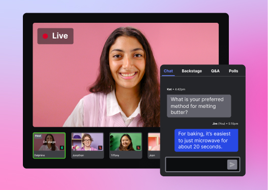
It’s important to start off on the right foot, though. That means picking the best webinar platform that offers all the accessibility tools you need to create a great experience for everyone. You don’t have to look far because we have a webinar feature that ticks all the accessibility boxes: live captions, chat functionality, and more. Check it out!
