Build a More Human Brand by Thinking Outside Your Style Guidelines
October 29, 2018
Topic tags
When we hear the word “brand,” we traditionally think of a logo, colors, font, or a set of visual guidelines we follow as a business so that people are able to recognize us consistently.
But, your brand is not just your logo, colors, or font. It’s what everyone who touches your company feels that it is. Your brand is the core spirit that your logo and colors (and everything else you create, say, or do) embodies.
“Your brand is the core spirit that your logo and colors (and everything else you create, say, or do) embodies.”
Sure, there are places where your logo and core brand are great for awareness and credibility. But there are also places where creating something outside your traditional brand guidelines could have a huge impact on your brand. These visual novelties can create moments that make your audience feel like they’re getting to know a new friend.
How Patagonia pushes their brand boundaries
Take Patagonia, for example. They sell a variety of items that have the same form of their logo on them, which is great for recognition and credibility. But, adding visual variety to their merchandise and various endeavors deepens their voice into more than a corporation — it makes them more human. For Patagonia, this range of styles all feel rooted in nature (earth tones, inspiring photography, mountain motifs, etc.) and their content and practices are all geared toward protecting and enjoying wild spaces.
Notice all of the different sub-brands present in this example, how they elevate each piece, but also how they all feel like they came from the same company. Do you feel more attached to the brand after seeing all of these pieces, as opposed to just the Patagonia logo and colors in the top left? I certainly do!
So, when does that consistency and core brand count? Where do we have the potential to let our audience in a little deeper, to show them what matters to us, and that they do, too? And if we start breaking outside of our logo and colors, how do we make it still feel like “us”?
What it means to be “on brand”
Let’s start with what it means to be on brand. At Wistia, our Creative Team has developed a set of statements that define our voice as a business. They’re medium-agnostic, and can be interpreted through writing, video, design, our job interview process, our internal communications, how we celebrate our successes and learn from failures, or even how we do sales:
- We are knowledgeable and helpful, but humble. We don’t take credit for our customers' successes.
- We are wholesome, polite, and professional. We don’t swear, and we’re not edgy.
- We are inclusive. This is for you (all of you). You’re always in on the joke.
- We are positive. We inspire through excitement, not fear of missing out.
- We are playful. Except when we’re talking to someone who’s upset about a bill, because that’s just annoying.
Above all, we want to make business more human. We showcase our own people, write conversationally, use video to make personal connections, and try to help other businesses do the same.
The core brand on our website is just one visual expression of this voice. Our font, GT Walsheim, is bubbly and rooted in geometry, just like most of the illustrations on our site. We use photographs and videos of our real team wherever we can, often in our own space where we actually work.
“The core brand on our website is just one visual expression of this voice.”
Our colors cover the whole rainbow, and we try to use at least two of them at a time for more of a playful feel. We tend toward rounded corners, patterns that look like confetti, and references to dogs and lemonade. All of these elements create a sort of “kindergarten chic” vibe, as we’ve half-jokingly referred to it internally.
Your brand should feel human, not robotic. It should incorporate different levels of expression, from the most conservative to the most experimental, and feature different tones for different situations.
When we hold a tight leash
There are instances when it’s important that we stick to this core brand, because deviation in styles and visuals could actually have a negative effect on our audience’s experience. If you’re deciding to stick to the visual script, make sure it has your audience’s best interests at heart, and it’s not done just to save time.
Designing our website and products
Our website is a single touch in a person’s journey through Wistia. When they’re on our site, they’re clicking around to different pages, usually not just seeing one page on its own, so the whole site should have a cohesive visual language.
Maintaining visual patterns on our website:
- Increases usability, and makes it easy for people to find what they’re looking for.
- Might even subconsciously communicate that our product is easy to use.
- Simplifies the design process for new page additions, which frees up time for you to make new fun things from scratch when it counts!
The same principles apply to our products–usability is paramount, so establishing visual patterns is crucial. Lack of patterns for what empty states, error states, or inputs look like means the user has to relearn those things over and over again, which is not fun.
When we let the brand run free
While our website is a single dot on a person’s Wistia journey, so many other brand touches don’t rely on consistent visuals for usability or understanding, so we have a ton of room to play. Again, think audience-first!
For example, each event we attend or host is bound by a unique place and time, so our visuals don’t have to be super consistent with our other event appearances we may do across the board. When we believe we’re speaking to an audience that will appreciate us “getting loose,” we can make things like custom, retro jerseys and put our Sales team on bikes for a “Tour de Wistia” booth. Oh yeah, it’s a true story.
Making something brand-new (pun intended) can:
- Add more depth to our voice and create another point for connection with our brand.
- Communicate that we’re always trying new things and thinking originally (which positions us as product leaders!)
- Inspire our audience to think more creatively and playfully themselves.
- Feel like a gift (It tells our friends, “Hey. We care about this, and we care about you. This is worth your time or dollars. It wasn’t easy or breezy, but you’re worth it.”)
Here at Wistia, we’ve experimented with creating sub-brands for a wide range of initiatives, from our first-ever original video series released last week (eek!) to internal events, to content on the blog.
Branding a video series
Last week, we launched One, Ten, One Hundred, a four-part docuseries about what it takes to produce an awesome video. We’ve never done anything like this before, so it was only fair that we gave the project the shiny new sub-brand it deserved. Wistia designer Eric Smith owned the brand and collaborated with our friend Billy Woodward on the illustrations. I asked him about the work:
Why did you decide to make a sub-brand for this?
Eric: It was a big project, unique for us, and our first video series — so we felt like it needed to have a brand identity that we could use to talk about it. I also put together many visual elements for the series videos themselves–title design, typography selections, color palette, and more, so it was an opportunity to use those elements to create a consistent brand experience for every piece of the project.
What did you know you needed to keep intact for the project to still feel “on brand”?
Eric: Going into the project, my intention was really to let the videos and content be the shining star of the brand. I created minimal brand elements that set this stage and supported the videos and viewing experience. Key elements that kept the brand consistent and on brand would be the multi-color palette, and the main typeface — GT Walsheim Condensed.
Tell me about the things that diverge from the core Wistia visual styles, and why you made those decisions.
Eric: We wanted the brand to feel connected to Wistia, but also subtly different and original. This was due to the fact that it was a new type of content for us, but would still live under our Wistia promotional umbrella and website. I chose colors that are very punchy and vibrant, similar to the Wistia palette, but in new hues and combinations we don’t normally use. I also chose to use our new Wistia brand typeface, GT Walsheim, but in the condensed style often in all caps to reinforce both the connection and uniqueness. For the video animations and supporting illustrations, we went with a playful, hand-drawn style with the same friendly energy our Wistia illustrations have but with a little looser, laid back feel.
The footage definitely shines, and those stickers rule. I love the dark gradients that we don’t usually use, but that give the page a real theater vibe. Thanks, Eric!
Positioning company events
We’ve created several events, from WistiaFest (RIP) to CouchCon, to Video Marketing Week. Each event has its own visual styles within the Wistia brand. Even each year of WistiaFest had a new set of styles! We weighed efficiency and brand recognition against freshness and delight, and there was no question. Having a new website, color palette, logo, and set of swag for the second and third years told new and repeat attendees alike that this was going to be a unique, thoughtful experience.
“Having a new website, color palette, logo, and set of swag for the second and third years told new and repeat attendees alike that this was going to be a unique, thoughtful experience.”
Video Marketing Week, a content series we published separately from our blog, had a distinct set of styles as well. Michelle Fine, another designer here at Wistia, created the sub-brand. I asked her about her process:
So, why did you decide to make a sub-brand for this?
Michelle: We were trying something completely new for us with Video Marketing Week, turning something entirely digital into an elevated experience. It was exciting for us, and we wanted to show our excitement through how we shared the event with the world. The hope was that our excitement would then translate to our audience through the visuals, and they would get excited too!
What did you know you needed to keep intact for it to still feel “on-brand”?
Michelle: There were less tangible, visual things that I felt were needed to keep the sub-brand…on brand. There are always easy constants, like our standard brand typeface or colors, but I’ve found it’s primarily an overall feeling you get that contributes to how “on brand” a style is. There are so many other things that contribute to that as well, such as illustration style and content, or page copy. All of these things paired together will inform how the brand feels, and how much it feels like Wistia.
Tell me about the things that diverge from the core Wistia visual styles, and why you made those decisions.
Michelle: With Video Marketing Week, I kept our typeface, GT Walsheim, for consistency, though I used a bold, oblique version to distinguish it from our Wistia styles and to give a little more of a dynamic energy to the sub-brand. The yellow was also a new color, not in our typical set of brand colors, and it had the same effect. But, keeping the color palette as a whole limited to white, yellow, and black made this new brand feel flashy and engaging while also ensuring that it never felt too far from home. Introducing a new magenta, turquoise, orange, etc. all together would have too easily moved this brand too far off track.
An elevated occasion, it was, indeed. I love that black and yellow contrast, and the cutting-edge energy it brought to our usual palette. Thanks, Michelle!
Creating beautiful content
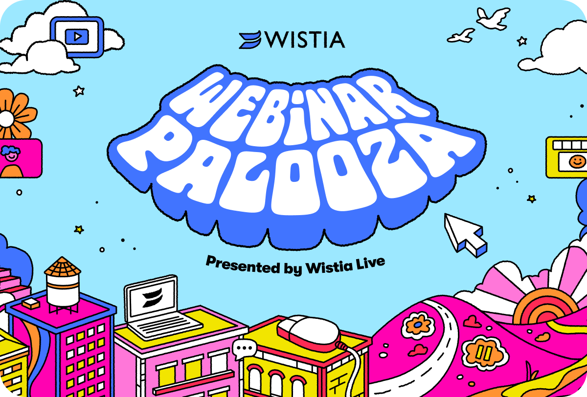
Our blog is another place that is ripe for exploration. The layout is consistent for usability, so there’s no risk in dropping in a piece of fun art to elevate the post, catch attention when it’s shared, and turn the blog homepage into a delightful gallery.
Take the images below, for example. Playful? Check. Humble? Check. Wholesome, inclusive, positive? Even as we’re talking about how we compare to a competitor — check! We experiment with different color palettes, use of gradients, use of depth, use of lines, use of space and planes, and more, but they still feel on brand.
Investing in creativity
In the end, anything new or creative takes effort, and not everything can or should be bespoke. Custom styles on landing pages require custom maintenance, and consistent systems serve usability and efficiency when those count, like on your website and in your products.
“In the end, anything new or creative takes effort, and not everything can or should be bespoke.”
But, giving our team the space to think big supports Wistia’s commitment to creativity across the company. It’s showing, rather than just telling, other teams and potential customers alike that we truly value and encourage originality. It’s reinforcing creativity as part of our culture, our brand, and a core strength of our products.
Once you hone-in on what your brand really is — a layer beneath your logo and your colors — the whole world of how it can be expressed will open wide. Have fun!
